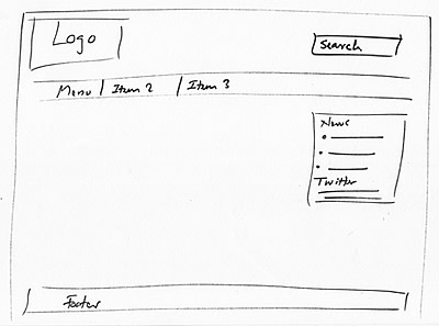
Yup, we are now ready to bring your website to life. This next bit is the easiest of it all. This is where we go with the standard stuff – logo, menu bars, footer, main area and the lot.
And, this is the time to add in those extra bits – a wee bit of news, a link to twitter perhaps and maybe a helpful little search box on top.
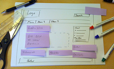
Once that is taken care of, it is time for our post-its to make their entry. A few dotted lines, a bit of scissor work…pretty much like ol’ Blue Peter…and we have a rough skeleton of the new concept shaping up.
Now then, don’t you expect to get all the things right in the very first go. You might need to move things around a bit, and maybe even start from scratch again! And then of course, there would be the stake holders all along, itching to add in their two pennies worth.
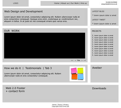
Anyway to cut a long story short, after a few sketches, and some rework you will find yourself in a position to tidy things up. Adobe’s fireworks is what we use for this. They have a nice set of tools and you can easily export to a PDF file. We usually ping these out to clients to show a tidied up version to confirm meeting notes and ensure that all issues were discussed.
This is where we introduce the concept of a grey box. The image below is the same stuff as the sketches, just tidied up a little.
The grey box process in fact relies on open thinking. We might easily get to the design at this point. You can almost see it, can’t you? But then this is the stage where feedback is all important. Take the time out, make sure all angles are covered and you have gotten in all that you would want, and the effort will definitely pay off at the end. These are the critical initial stages. People are at their most creative, ideas are flowing and no one is bound by limits of nice looking designs that rail road you into one way of thinking. Above all, costs are low. If you don’t like how things are going, you simply bin them and just start all over again. No hassle there.
Now when you finally have the rough sketch, go home, show the wife, the kids, anyone you like. (And, when it comes to the comment part, remember the wife’s bit is not to be discarded lightly! They might not be the ultimate authority on web site design or eMarketing. But that is one important source to be relied on for strong opinions of what a site should be like, and what designs are cool. Squeezing out a few minutes in between the baby’s nap and the day’s washing for a quick recipe from Jamie Oliver’s cookery blog, while whisking through eBay and netmums – count on them for some practical opinion on what a quick surfer would want from a site.)
Time for a quick PC disclaimer! The third party opinion does not have to be limited to ‘the wife’ alone. It could be your partner, your mum, your dad or a web savvy neighbour- just about anyone. Basically what we are saying is this – show people. A few extra pairs of eyeballs to spot flaws that you might have missed – a great internet thing called ‘crowdsourcing’. Well, this opinion bit is not based on any solid survey or poll, just anecdotal stuff that was discussed in the office and has been testified as quite an effective tool.
Are you still there with us on this?
- No? Good luck, we wish you well.
- Yes? We really are going to get on! Call us.
P.S. Did you spot the ol’ post-it note in the grey box? It managed to stick on this far. Bet you the designer will get rid of it in the next stage!


