Yesterday Imre visited the Internet World exhibition in Earl’s Court, London. We attended a couple of seminars on Web 2.0 and found some very interesting ideas and suggestions.
· Web 2.0 is about harnessing the structure of the internet to network with others.
· Web 2.0 is a mentality.
· A 1.0 company treats everyone as a user, th
ere is no communication. They’re not interested in feedback. Any research or changes are done through a “one way mirror”. They think they know what the user wants.
· A 2.0 company has a flat management structure. Google is a good example they have roughly 1 manager to 40 staff as opposed to the average 14. Too many chains of command can cause communication problems. Google also give 20% of the time their staff work to letting them choose their own projects to work on. Most of Google’s new products come from this 20% “free time”.
· AltaVista was a limited search engine as it compared purely by page content. Google realised it was the links that were important web structure.
· Another Web 2.0 example is MailWasher. You can only stop spam addresses in programs like Outlook by blocking them individually yourself time consuming and non efficient. MailWasher not only blocks spam but reports it to everyone else. The more reports a mail gets, the higher the priority climbs until it gets blacklisted.
· More people = more trust and strength. For example, the concept of eBay, buying goods online from faceless merchants, is about the most untrustworthy idea you could think of. What makes it successful and trustworthy? The users. Rating sellers means you can instantly find someone who will deliver a quality product and service.
· Employment through networking. LinkedIn is the grown-ups MySpace. Web 2.0 is about social networking, and LinkedIn provides you with a platform to
collect professional contacts. Say you have 5 contacts, who each have 20 contacts, who in turn each have 20 contacts. You’re quickly exposed to a wide network of people and potential business.
· Social networking is Web 2.0. 1 to 1, 2 to 2 or n to n communications, not one way.
· Web 2.0 is about bringing people together conn
ecting and communicating.
· When speaking of products or services, speak of the benefits not the features. Example Feature – AMD Athlon 64 X2 Dual-Core CPU. Benefit This makes your computer run fa
ster. Don’t be too technical unless user asks for it, keep it simple.
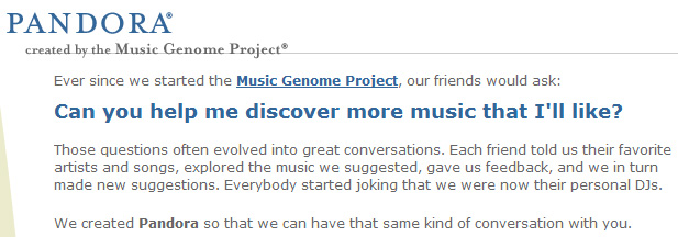
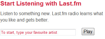
· Don’t expect people to know what you do. Example :
Pandora.com

What do they actually do?

Last.fm
We know straight away what last.fm does.
· Trust is harder in 2.0. You’re connecting freely with thousands of others so trust will be an obvious issue; there are strength in numbers though. For example, Sony hired a marketing agency to pose as a young boy blogging about how much he wants his parents to buy him a Playstation Portable (PSP) for Christmas. People quickly worked it out and, through using the blog comments, ripped Sony apart.
· How do you reassure people that you’re genuine? Tough Policies. Make sure they know that fake comments, reviews, ratings, listings etc. earn instant bans / blacklists. Tight registration can also help such as image caps (dynamically created images where the user has to type in a sequence of characters). Other options are referred registration and member ratings.
· Web 2.0 is about making the internet fun and safe.
· How to make it fun? Interaction. Ajax and Flex are quickly becoming the norm in Web 2.0 interaction. Sending small amounts of data instead of refreshing the whole page makes your site faster, smoother and more accessible.
· Never think about what you can do, always ask what do your users want to do.
· Explain the purpose, benefit and usage of interactions. Teach the user how to use your site.
· Ajax and Flex can be extremely helpful for registrations forms, shopping carts, blog comments and ratings. Being able to update part of a page without a refresh is the way forward, but don’t forget to let your users know what is going on! “Yellow fades” that last a few seconds after data has changed on a page seem to work well (BaseCamp and WordPress use this feature).
· Tags are becoming an integral part of Web 2.0. Allowing users to tag pages and items they wish to keep for future reference is accessible and fun. Tags are notorious for being hard to grasp at first so make sure to explain them to your users, for example, “Tag this product (what’s this?)”. Don’t be embarrassed to explain how things work, while the designer knows the layout the user does not teach them.
· More interaction can come with drag and drops on the web. Using familiar move cursors found on OS desktops provide a natural transition from desktop interaction to web interaction. Context sensitive cursor cues are very important. Example, Flickr You have a photo and title field. Hover over the title and a box will display “click to edit”. Clicking the box allows you to enter a different title, then Ajax takes over and updates it without refreshing the page.
· Teach users the “rules” of your site. For example, on Google Maps you may have just zoomed in on an area and want to zoom back out. The instant web user reaction is to click the back button, which obviously kicks them back to the main page. Ajax and Flex are great at providing interaction but let users know when they are being used.
· When possible, provide alternatives and conform to W3C standards and the ARIA roadmap. Web 2.0 can make things hard to validate but you must try.
· Usability testing, eye tracking.
The talks really opened my eyes to what Web 2.0 will mean to internet users and I’m looking forward to seeing it develop!
